Thoughts on the redesigned homepage
-
First thing that jumped out at me - the link to the release calendar always goes to the default calendar (All Series/All Events/All Formats), not to your individual saved defaults (which for me would be (Follows Only / All Events / All Formats).
The top menu is now in a different order depending on which page you're on - Home/Blog/Series/Forums/Calendar/User on the home page, but Home/Series/Calendar/Blog/Forums/User everywhere else.
The submenu order doesn't match the order things are shown on the page - It lists Top / Continue Reading / Summer Blockbuster Sale / New Series / New Releases / Reader's Library, while the page is actually ordered Top / Summer Blockbuster Sale / New Series / New Releases / Reader's Library / Continue Reading.
The 'Welcome back / Join Today' section can be truly gigantic when viewing the site on a PC. Over half the height of my monitor, in fact.
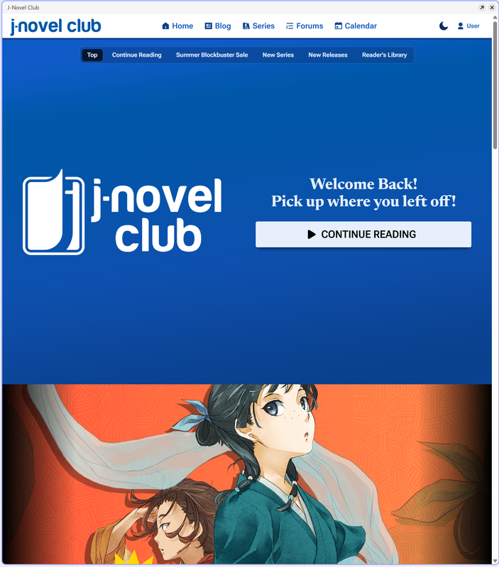
Edit: It looks like this one has been adjusted since I took the screenshot. Still a lot of wasted space, but I can at least see the sale without having to scroll.
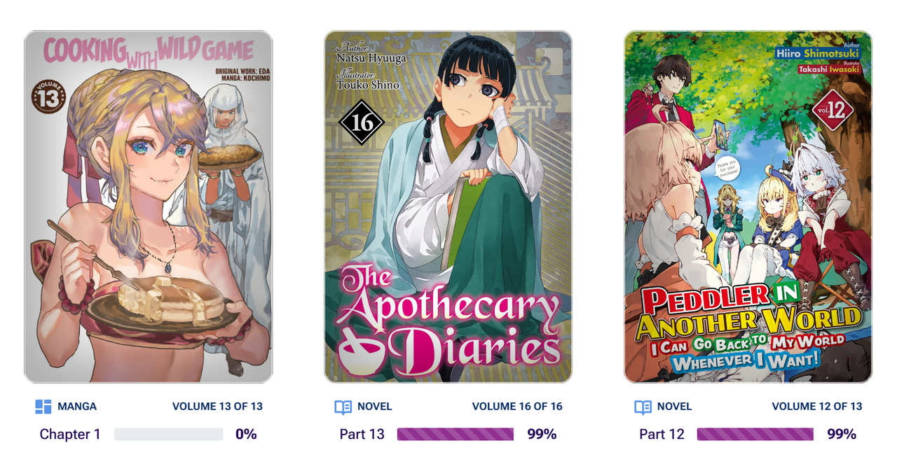
Then on to the Continue Reading section. I can spot stuff in there that's 98% or 99% read. And 0% read. The Minimums and Maximums might need reviewing.
Plus, I can spot at least two where there isn't anything else to read (because they're in pre-publication and I'm up to date with the currently released part). It shouldn't be telling me to continue reading The Crown of Rutile Quartz or Fired? But I Maintain all the software! until the next part releases.
And the Reader's Library again has the issue that it isn't being clear what's actually in the Library. For example, Cooking with Wild Game is shown as 35 volumes, but only 3 are actually in the library.
-
To add to that, I now have to go to the calendar page to find today's prepubs
It was more convenient when I click on today's prepubs directly from the homepage
“There’s always a story. It’s all stories, really. The sun coming up every day is a story. Everything’s got a story in it. Change the story, change the world.” ― Terry Pratchett, A Hat Full of Sky
-
@Lily-Garden Agreed.
-
@Lily-Garden said in Thoughts on the redesigned homepage:
To add to that, I now have to go to the calendar page to find today's prepubs
It was more convenient when I click on today's prepubs directly from the homepage
Yeah, this was the biggest loss for me, it was nice to access recent and peek at upcoming prepub releases with the covers and such, but now I have to scroll past a previous day's worth of releases to find the prepub I want, unaided by covers.
-
This is kind of blunt, but this new look doesn't really look good on a desktop. I'd get it on a mobile (even though I preferred the previous look), but on a desktop it's just... like new reddit vs old reddit to give a comparison.
One unbreakable shield against the coming darkness. One last blade, forged in defiance of fate.
Let them be my legacy to the galaxy I conquered. And my final gift to the species I failed. -
I can't say I'm in favour of all these sites that decide to drop the mobile experience on their desktop site. If nothing else, there needs to be an option to pin the header to the top the way the floating nav bar does since in my mind, that's more important than being able to constantly shift to whatever the current site news is.
-
Oh what the hell? Didnt even know this was happening. God what an ugly mess this is now, I liked the upcoming prepubs and currently released section ffs guys can you actually ask the members that use your damn site what they like? Now your causing more bullshit to simply look at what's released today and what hasn't yet.
Please for the love of god put the upcoming and released section back in >_<
-
@jpwong Unfortunately it looks like this is a trend now not only for Anime, Manga, and LN sites but also most commercial and technical sites. My bank, credit cards, insurance, etc. have all changed to this type of format to accommodate those using smart phones and tablets. Woe to us desktop/laptop old fogies who can't adapt to the brave new world.
-
My brain keeps trying to interact with the carousel position indicator widget as if it's a scroll bar. It also doesn't help that the deselected pips require a precision click to use; about half the time I miss and click between two pips. It would also be nice if the carousels also reacted to horizontal scroll wheel events. I guess the simplest way I can describe it is that the new interface is unfriendly to mouse & keyboard input.
-
@karasutengu The whole point in mobile browsers sending that they're mobile browsers was so sites could have layouts that accomadated the different size and orientation. I don't mind when they try to mash both together, but the problem is that generally the functionality ends up taking a massive hit on desktop because how you use a site with touchscreen vs with a mouse and keyboard is somewhat different.
-
@karasutengu this isnt even for mobile users! Its worse now then before for mobile users, addon to the bugged ui for most parts and ive changed to the app.
-
I am not a fan of how it looks in both use cases, but its especially silly on desktop to launch the page and be met with only two large banners. Please bring back the upcoming releases panel and better balance the webpage.
I really don't think there was anything wrong with the old page on desktop, it worked well and I don't think it was ugly or anything either.
-
Glad to see there's widespread agreement on this redesign.
Who had the bigger downgrade though, J-novel club or Bookwalker?
-
on the positive side: I appreciate the "continue reading' section that tracks progress (but somehow isn't complete?) Also, when I logout to check if the rules/how the club works is intuitive, it is pretty clear.
I agree with other commenters about the calendar: for me a big (the main) benefit of membership is the pre-pubs. I want to see what is 'on deck' in the coming days. I get that JNC can't post when stuff gets published/ebooks get released for reasons, but 'which pre-pubs usually come out on Tuesdays' should be easy to find
I read banned books
-
@Jon-Mitchell I never really understood how that continue reading thing is actually tracking anything, I'm caught up on every series I'm following (except for pre-pubs out this week) but the continue reading links keep taking me back to old volumes, there needs to some sort of "mark part read" or something to clean up thing it thinks I have read. I just use the calendar to keep track of things (which I still have a beef with that clicking view earlier entries takes you back like half a month now when 90% of the time I want to go back 2 days at most).
-
@Tacitus said in Thoughts on the redesigned homepage:
This is kind of blunt, but this new look doesn't really look good on a desktop. I'd get it on a mobile (even though I preferred the previous look), but on a desktop it's just... like new reddit vs old reddit to give a comparison.
This a hundred times. I can't stand when a site updates and it's clearly intended purely for mobile with every element taking up a massive amount of screen real estate and ten miles of padding on everything. I like to actually see more than two things on my screen at once. Also not a fan of change just for the sake of change. But that's one thing that's never going to actually change.
-
Remember guys to email their support about this change and hopefully we can get it changed a little!
-
I saw the new redesign yesterday and could not find the releases for that day. Ended up just using the mobile app, and found that the clean old site is still used for mobile browsers this morning. It honestly looks like some one asked an ai chat bot to design a mobile friendly site and it went with all the worst ideas. Then they made it the desktop site instead of mobile.
I like being able to quickly see upcoming releases which the mobile app does not show, and then looking at recent releases because I read several things I haven't favorite. Gaint banners with useless information or suggesting I reread last weeks prepub do nothing but annoy me into considering if I should spend my money somewhere else.
-
Thank you for the feedback, everyone. We apologize for the inconvenience caused by the update. I have written down a bunch of action items that we'll be working on.
-
@Z_Goddard Thanks for your consideration of the readers' comments. Other sites I'm on that changed their on-screen format in the past 8 months never responded to reader comments/concerns.