Forum new look?
-
Hi,
Thank you for the feedback. Can I ask for more specifics?
Are you referring to pages for topics that are unread vs read?
I am jumping the gun here a bit below:
Or is this about a forum topic itself?I am having trouble visualizing what a forum topic with 5 pages would look like to indicate that page 1 and 2 were read, and pages 3-5 were unread.
usually when you open an unread topic. It opens at the last message read.
Sorry but J-Novel Club does not publicly comment on any potential licensing decision or acquisitions.
J-Novel Club, Future Volume Release Schedule
Manga FAQ
Premium Content List -
So if I set the zoom on Chrome to 80% or below I can see in the thread list the statistics like the number of posts, views and the preview of the last reply, that are hidden with higher zoom levels. But when I reply to a thread, if I don't set the zoom to 90% or higher the top bar in the post editing window with the Cancel and Send buttons is hidden, making impossible to send replies unless I use 90% or 100% zoom. So either I have to give up seeing all the details on the threads list, which is kinda ridiculous on a 12 inches tablet, or I have to constantly change zoom. I hope JNC staff will be able to make the forum work better on larger mobile screens.
-
@Rahul-Balaggan
Topics that are read vs unreadPreviously when I went on the forum the l could tell at a glance if— for example I had already read the Bookworm discussion topic—-because the topics were color coded for read vs unread
Now it’s difficult to tell which topics people have recently posted in and so it’s hard to keep up with the discussions
-
Thanks for the feedback. I’m assuming you’re referring to the Recent section, where read and unread topics appear together.
We’ve made an adjustment so topics with unread posts now have two indicators as seen in these photos.
The blue to the left of the topic for unread.


-
Sorry but J-Novel Club does not publicly comment on any potential licensing decision or acquisitions.
J-Novel Club, Future Volume Release Schedule
Manga FAQ
Premium Content List -
@Rahul-Balaggan
It opens but doesn't close. -
yup, going to be like that for a while unfortunately
-
Thank you to the forum team for working to improve the issues, I just tried a few different darker skins again and contrast and readability have greatly improved and they are mostly now readable, however text in quote blocks is still very low contrast with the "vapor" skin, the text is light blue and the quote block is slightly darker blue. I would include a screenshot but imgur does not appear to be working at the moment.
-
I'm kind of hoping the custom css overrides will be re-enabled again, though it's not the end of the world if they aren't
-
This should be fixed.
-
notifications on mobile in the side bar should now be back.
It will require a refresh
-
"Unread" page seems to be broken. I get notifications about new posts on threads I am watching. But I used to see those also in the "unread" page before. Now I see some threads but not all.
-
I am afraid we can't reproduce this.
I marked all topics as "read". Then I waited.
A topic (Seafoam V2) has a new post. It is showing in unread for me, and in recent.
Recent shows no other new post from when I marked all as unread.
Sorry but J-Novel Club does not publicly comment on any potential licensing decision or acquisitions.
J-Novel Club, Future Volume Release Schedule
Manga FAQ
Premium Content List -
@Rahul-Balaggan Worked to open, but not to close.
-
@Rahul-Balaggan i logged out of jnc and logged in again. I see the notification side bar with 12 notifications with many for new posts. I verified that I am indeed "watching" those threads and they show up in "recent" as unread - in bold and with blue bar on the left. But they don't show up on my unread page.
I still haven't cleared browser cache. Will try that and report here. -
Notifications now seem to work for me on my tablet, thanks JNC for fixing that.
-
@Rahul-Balaggan Ran into one more today.
Setup for this bug:
- Use a screen wide enough you get the 'popup' post editor instead of the full-screen one.
- Go to a forum page with enough content to fill your screen vertically
- Close the post editor popup (either by making a post, editing a post, or hiding the editor)
Up to 575 pixels wide, the 'your next/last post' shortcut is below the controls on the last post, and the full width of the display.
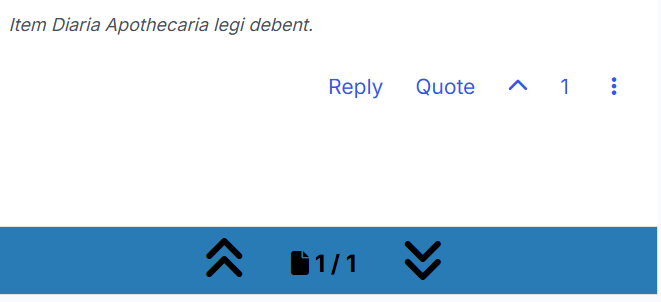
Up to 991 pixels wide, still beneath the controls, but over on the right instead of full-width.
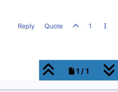
Above 991 pixels, it overlaps the controls (so long as the forum page you're on is at least 1 screen tall):
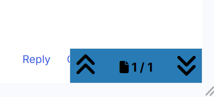
I need the render width to be over 1600 pixels before the controls are fully visible again - this last screenshot is at 1615 pixels wide.

If you haven't been through the post editor on that page, the page gives extra space below the last post for the shortcut to go. The post editor takes the space away again, but only for that particular width range.
(I just happened to run into this while commenting on a manga part today - with two windows side-by-side splitting my screen, they each get around 1200 pixels of width, landing me squarely in the unsweet zone.)